Outlook Conceptual Exploration
Outlook Conceptual Exploration
Outlook Conceptual Exploration
Redesigning the Outlook iOS
app interface to prevent information overload.
Redesigning the Outlook iOS
app interface to prevent information overload.
Redesigning the Outlook iOS
app interface to prevent information overload.

Team
Team
Team
Independent
My Role
My Role
My Role
Designer
& Developer
Timeline
Timeline
Timeline
Sept - Dec 2023
Tools Used
Tools Used
Tools Used
Figma
HTML & CSS
JavaScript
Overview
Overview
With Outlook being a prominent tool for emails, schedules, and tracking tasks in the workplace, it is important to ensure that the app is usable to wide user base. Therefore, it is crucial for information to be displayed in a clear and concise manner to avoid miscommunication and errors.
Through observing user behaviour, analysis of behavioural studies and user testimonies, there was a recurring challenge regarding parsing through information on the app. Consequently, I aimed to redesign Outlook’s user experience to combat information overload.
There is a high overlap between ADHD and visual stress
There is a high overlap between ADHD and visual stress
Heavy cognitive load may overwhelm users who face certain attention constraints such as ADHD/ADD, fatigue or being in a distracting environment.
High visual stimulus and executive dysfunction are correlated.
Due to attention and executive dysfunction, this leads to lower productivity.
Heavy cognitive load may overwhelm users who face certain attention constraints such as ADHD/ADD, fatigue or being in a distracting environment.
High visual stimulus and executive dysfunction are correlated.
Due to attention and executive dysfunction, this leads to lower productivity.
Heavy cognitive load may overwhelm users who face certain attention constraints such as ADHD/ADD, fatigue or being in a distracting environment.
High visual stimulus and executive dysfunction are correlated.
Due to attention and executive dysfunction, this leads to lower productivity.

Credits: Magnet.me
Credits: Magnet.me
Solution
Solution
Users feeling overwhelmed meant that they may overlook information or feel frustrated while performing their tasks.
To empower users, the iOS app requires:
Reorganization of features and information for easy viewing and comprehension.
More frequent use of clear icons and symbols
throughout the app helps with this purpose as well.
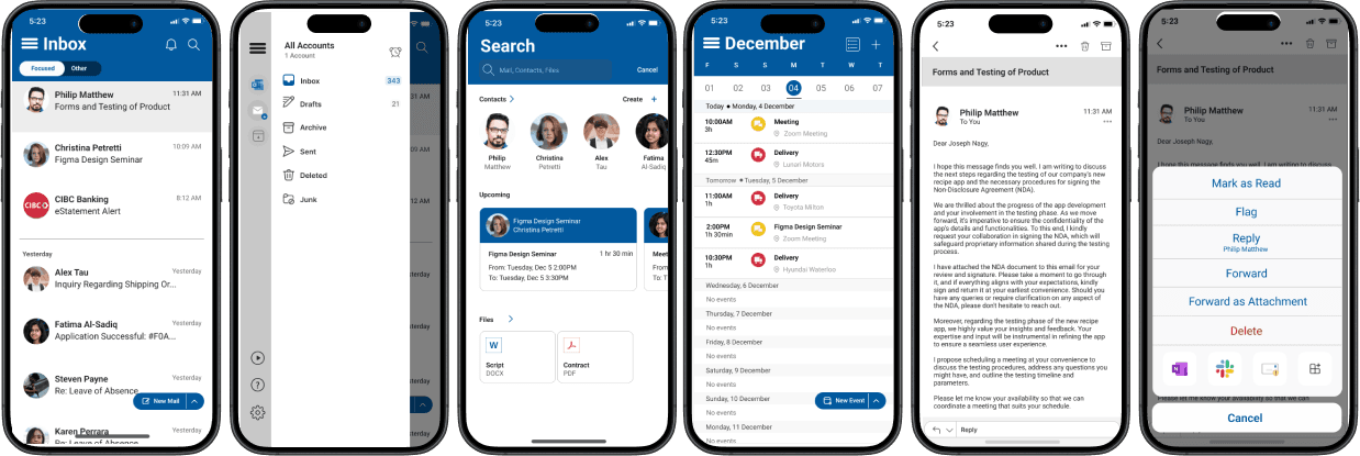
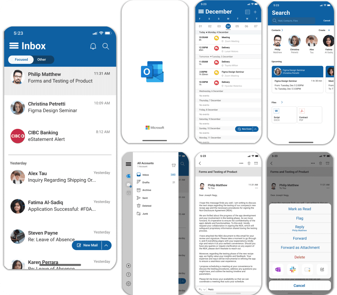
Feature Highlights
Feature Highlights
The modified experience focuses on enhancing readability and mitigating information overwhelm through:
The modified experience focuses on enhancing readability and mitigating information overwhelm through:
Simplified Inbox
The inbox consists of emails with just the subject line and date. The contents of the navigation bar has been moved to the menu.
Simplified Inbox
The inbox consists of emails with just the subject line and date. The contents of the navigation bar has been moved to the menu.

Application Tray
Placement of the Add-Ins that Outlook has to the bottom of the menu allowing you to focus on frequently used mailing actions first.
Application Tray
Placement of the Add-Ins that Outlook has to the bottom of the menu allowing you to focus on frequently used mailing actions first.

Final Design
Final Design
Research
In the modern world, emails have become paramount for communication and organization especially in the workplace, with Outlook being one of the most widely used platforms.
Improving the user experience for individuals with attention constraints is vital for improving productivity and inclusivity. I aimed to identify unique needs and behaviour for this user group by understanding various attention related challenges by mapping out constraints related to attention:
Research Methods
Research Methods
Literature Reviews
POEMS Observation
Surveys
Informal Interviews
Prototype Usability testing
Permanent
ADHD, ASD, and depression
Permanent
ADHD, ASD, and depression
Temporary
Prolonged stress and head injury
Temporary
Prolonged stress and head injury
Situational
Stress, being in a meeting
Situational
Stress, being in a meeting
Permanent
ADHD, ASD, and depression
Permanent
ADHD, ASD, and depression
Temporary
Prolonged stress and head injury
Temporary
Prolonged stress and head injury
Situational
Stress, being in a meeting
Situational
Stress, being in a meeting
Research Questions
Research Questions
Research Questions
Does information overload affect the attention-span of individuals with ADHD?
Does information overload affect the attention-span of individuals with ADHD?
Does information overload affect the attention-span of individuals with ADHD?
Is Outlook’s user interface too distracting?
Is Outlook’s user interface too distracting?
Is Outlook’s user interface too distracting?
How might we
How might we
. . . improve on the design of Outlook
to better cater to users whose attention
is impacted?
. . . improve on the design of Outlook to better cater to users whose attention is impacted?
. . . improve on the design of Outlook to better cater to users whose attention is impacted?
Converging Points
Converging Points
Constraints
Constraints
50% of neurodivergent participants found the UI challenging and cited issues of crowded UI with icons being too large.
50% of neurodivergent participants found the UI challenging and cited issues of crowded UI with icons being too large.
Users’ frustrations
Users’ frustrations
Users face frustrations or were confused by all the information present.
Users face frustrations or were confused by all the information present.
Task Interference
Task Interference
Information overload affects the concentration of users with ADHD and neurotypical people as well, to a lesser extent.
Information overload affects the concentration of users with ADHD and neurotypical people as well, to a lesser extent.
Design Considerations
Design Considerations
Simplify
Simplify
The information present on the inbox and email screens needs to be reduced and relocated to various menus.
The information present on the inbox and email screens needs to be reduced and relocated to various menus.
Increase Contrast
Increase Contrast
Increasing the size of important details such as the subject line, sender’s profile picture, etc.
Increasing the size of important details such as the subject line, sender’s profile picture, etc.
Existing features
Existing features
Leverage existing UI assets and features present on older versions of Outlook that are useful for mitigating attention challenges.
Leverage existing UI assets and features present on older versions of Outlook that are useful for mitigating attention challenges.
Converging Points
Constraints
50% of neurodivergent participants found the UI challenging and cited issues of crowded UI with icons being too large.
Users’ frustrations
Users face frustrations or were confused by all the information present.
Task Interference
Information overload affects the concentration of users with ADHD and neurotypical people as well, to a lesser extent.
Design Considerations
Simplify
The information present on the inbox and email screens needs to be reduced and relocated to various menus.
Increase Contrast
Increasing the size of important details such as the subject line, sender’s profile picture, etc.
Existing features
Leverage existing UI assets and features present on older versions of Outlook that are useful for mitigating attention challenges.
Low-Fidelity Wireframes
Low-Fidelity Wireframes
Wireframes were created with the intent of exploring relevant UI changes and their feasibility. Changes made include:
Increase of the amount of whitespaces
Reduction of information of lesser importance.
Wireframes were created with the intent of exploring relevant UI changes and their feasibility. Changes made include:
Increase of the amount of whitespaces
Reduction of information of lesser importance.
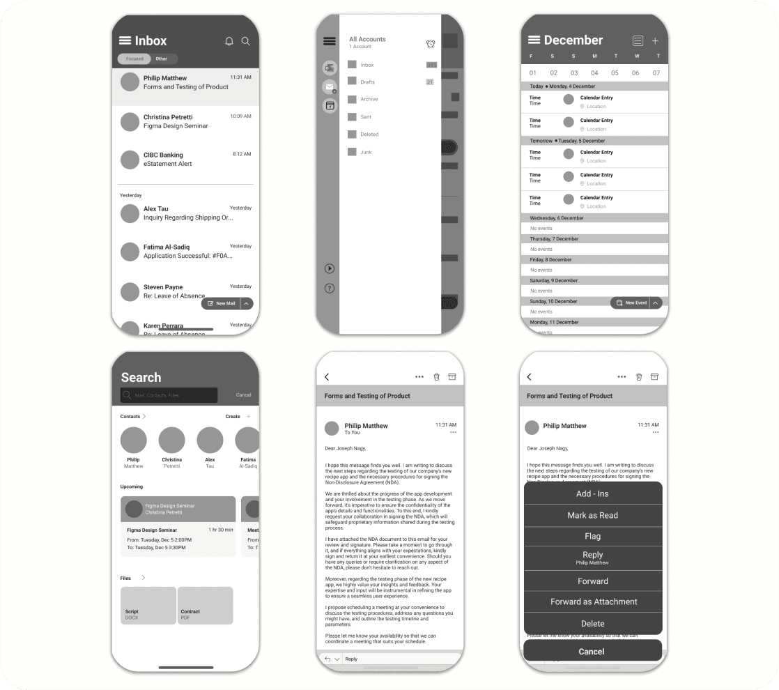
Mid-Fidelity Wireframes
Mid-Fidelity Wireframes
This iteration follows the insights found through the usability test of the previous wireframes. Some of the changes made include:
Lightened up the wireframe for the calendar page to match the look of the page in light mode (based the look off of dark mode at first)
This iteration follows the insights found through the usability test of the previous wireframes. Some of the changes made include:
Lightened up the wireframe for the calendar page to match the look of the page in light mode (based the look off of dark mode at first)
This iteration follows the insights found through the usability test of the previous wireframes. Some of the changes made include:
Lightened up the wireframe for the calendar page to match the look of the page in light mode (based the look off of dark mode at first)
Reverting size of pfp icons on the inbox page to original size
Removal of the compose email tab as I did not need to change the UI of the page in any way (removing redundant changes)
Removal of the applications on the options pop-up in the email page
Reverting size of pfp icons on the inbox page to original size
Removal of the compose email tab as I did not need to change the UI of the page in any way (removing redundant changes)
Removal of the applications on the options pop-up in the email page
Reverting size of pfp icons on the inbox page to original size
Removal of the compose email tab as I did not need to change the UI of the page in any way (removing redundant changes)
Removal of the applications on the options pop-up in the email page
User Testing
User Testing
A formal usability test was conducted after the creation of the low-fidelity wireframe. Participants were recruited on the basis of their comfortability with using the iOS Outlook app. Four participants who use the app at least once a week was selected
A formal usability test was conducted after the creation of the low-fidelity wireframe. Participants were recruited on the basis of their comfortability with using the iOS Outlook app. Four participants who use the app at least once a week was selected
A formal usability test was conducted after the creation of the low-fidelity wireframe. Participants were recruited on the basis of their comfortability with using the iOS Outlook app. Four participants who use the app at least once a week was selected
Insight 1
Keep profile picture icons of the sender of an email at the size of the original app instead of reducing it
Insight 2
Relocation of the application tab at the bottom of the inbox to the menu is an effective way to reduce the information overload.
Insight 3
Avoid removal of icons in the pop-menu when the kebab menu icon is clicked within an email.
Insight 3
Avoid removal of icons in the pop-menu when the kebab menu icon is clicked within an email.
Insight 2
Relocation of the application tab at the bottom of the inbox to the menu is an effective way to reduce the information overload.
Insight 1
Keep profile picture icons of the sender of an email at the size of the original app instead of reducing it
Keep profile picture icons of the sender of an email at the size of the original app instead of reducing it
Keep profile picture icons of the sender of an email at the size of the original app instead of reducing it
Future Steps
Future Steps
As Outlook is a tool used by various age groups, a toggle button must be added to the settings page to change the UI if the user prefers giving them more power in how they use the application.
I feel this is necessary as older audiences and working professionals who are not proficient with technology and its conventions may find it difficult to navigate.
Reflection
Reflection
Accessible Design
This project gave me insights on the importance of accessible solutions and the depth required to ensure that these solutions truly address the needs of the target audience. By leveraging quantitative and qualitative research in various stages of the project, I uncovered opportunities for improving Outlook’s user experience as well as finding and resolving gaps in my research.
Plan for the unexpected
I faced a few hurdles in my conceptual exploration which slowed down my progress at first. Some of the hurdles experienced could have been resolved with further planning. With guidance from other designers, I encouraged myself to plan in depth before I continued my research.
Plan for the unexpected
I faced a few hurdles in my conceptual exploration which slowed down my progress at first. Some of the hurdles experienced could have been resolved with further planning. With guidance from other designers, I encouraged myself to plan in depth before I continued my research.
Thanks for Visiting!
This website was designed and built by me.
© 2024 Andrew George Geevarghese
Thanks for Visiting!
This website was designed and built by me.
© 2024 Andrew George Geevarghese
Thanks for Visiting!
This website was designed and built by me.
© 2024 Andrew George Geevarghese